How to Build a Consistent Icon System for Your Product
Learn how to build a consistent icon system for your product. Improve UI design, scalability, and user experience with a structured icon approach.
Apr 16, 2026 • 3 min read
A consistent icon system is one of the most important parts of modern UI design. Without it, interfaces quickly become messy, inconsistent, and harder to use.
In this guide, you will learn how to build a scalable and consistent icon system for your product.
What Is an Icon System
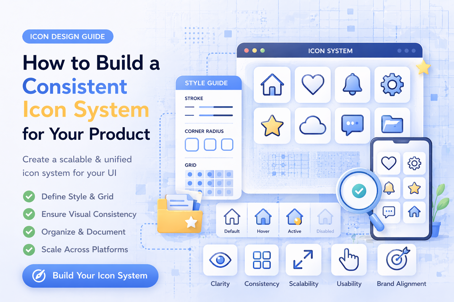
An icon system is a structured collection of icons designed to work together across a product.
It includes:
- consistent styles
- unified sizes
- defined usage rules
- reusable components
A good icon system ensures that every icon feels like part of the same interface.
Why Icon Consistency Matters
Inconsistent icons create problems:
- confusing UI
- poor visual hierarchy
- unprofessional appearance
- reduced usability
Consistency improves:
- clarity
- navigation
- user trust
- design quality
Step 1: Choose a Single Icon Style
The first step is selecting one primary style.
Common styles:
- outline icons
- glyph (filled) icons
Choose one and stick to it.
Mixing styles leads to visual inconsistency. If you are unsure, read: Outline vs Glyph Icons
Step 2: Define Icon Sizes
Icons must follow a grid system.
Common sizes:
- 16px
- 24px
- 32px
- 48px
Use consistent sizing across the entire UI.
This ensures alignment and visual balance.
Step 3: Standardize Stroke and Fill
If you are using outline icons:
- keep the same stroke width
- use consistent line endings
- maintain equal spacing
If you are using glyph icons:
- ensure consistent fill style
- avoid mixing weights
Consistency at this level makes a big difference.
Step 4: Create Clear Usage Rules
Define where and how icons should be used.
Example rules:
- navigation icons must include labels
- icons should not be used as decoration
- icons must remain recognizable at small sizes
Clear rules prevent design inconsistencies.
Step 5: Organize Icons by Category
A good system is easy to navigate.
Organize icons into categories like:
- navigation
- actions
- data
- communication
You can explore structured categories here: icon categories
Step 6: Use the Same Icon Source
One of the biggest mistakes is mixing icons from different sources.
This leads to:
- different styles
- inconsistent proportions
- broken UI
Using a single icon library helps maintain consistency.
Step 7: Test Icons in Real UI
Icons should not be tested in isolation.
Check them in:
- navigation menus
- dashboards
- buttons
- mobile layouts
This ensures they work in real conditions.
Step 8: Optimize for Performance
A scalable icon system must also be efficient.
Best practices:
- use SVG format
- optimize file size
- avoid unnecessary complexity
Learn more here: Best Icon Formats for UI Design
Step 9: Plan for Scalability
Your icon system should grow with your product.
Make sure:
- new icons follow existing rules
- styles remain consistent
- system is easy to extend
This prevents redesign later.
Common Mistakes to Avoid
- mixing icon styles
- inconsistent sizing
- unclear icons
- overusing icons
- ignoring system rules
Avoiding these mistakes keeps your UI clean.
Build a Strong Design System
An icon system is part of a larger design system.
Together they improve:
- development speed
- UI consistency
- user experience
Vectizon helps by providing:
- consistent icon styles
- multiple formats (SVG, PNG, JPG, EPS)
- structured categories
Explore:
Final Thoughts
A consistent icon system is not optional. It is essential for modern products.
To summarize:
- choose one style
- define sizes and rules
- keep everything consistent
- use a structured library
- plan for growth
If you want to build a scalable and professional UI, explore the icon library or check available pricing plans.
A strong icon system does not just improve design. It improves your entire product.
Related Articles
Popular Categories
Ready to use better icons in your UI?
Download free icons, or unlock unlimited premium packs for product, web, and SaaS workflows.